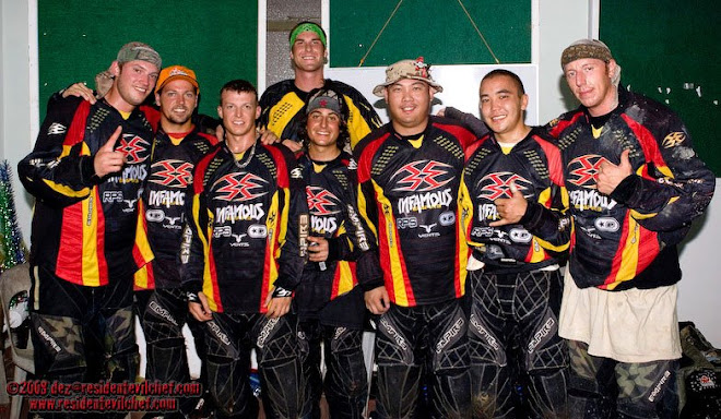
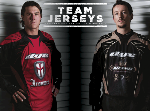
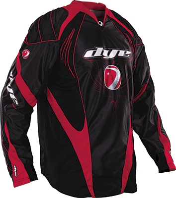
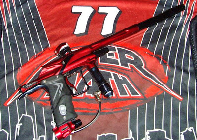
First thoughts on the new 08 Ironmen jersey is that it doesn't really impress - it kinda looks like something from the 06 and 07 jerseys put together. I still prefer the 07 away in black.
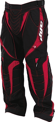
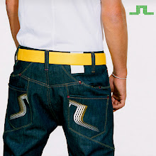
The C8 pants looks like it just has extra red panels in the front..


2 comments:
UGLY..
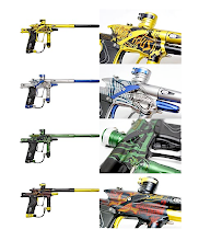
C7 design is better. I guess they ran out of new design idea. Maybe for C9 jersey they will add in side mirror on the jersey..
i rather have high beam to blind opponent and rear LCD/DVD to entertain team mates.
Post a Comment